Writing a book is not everything, you
need to make it look beautiful for the kids to read. It is important that kids
read books as well as understand the concept of book reading. In addition, that
can be explained well in illustrated books. These illustrations are done on the
software that is used for graphics. This artistic work has fed our eyes for a
long-time. Children books and advertisement uses colors, designs and the
techniques for attracting readers and consumers respectively. It has been part
of our business industry as well as education. In Education Sector, we can see children’s book illustrations,
which attract kids to read and perform in their behavior. Here below, we are
going to explore graphic design style that everyone has been looking for his or
her books.
The three – Dimensional:
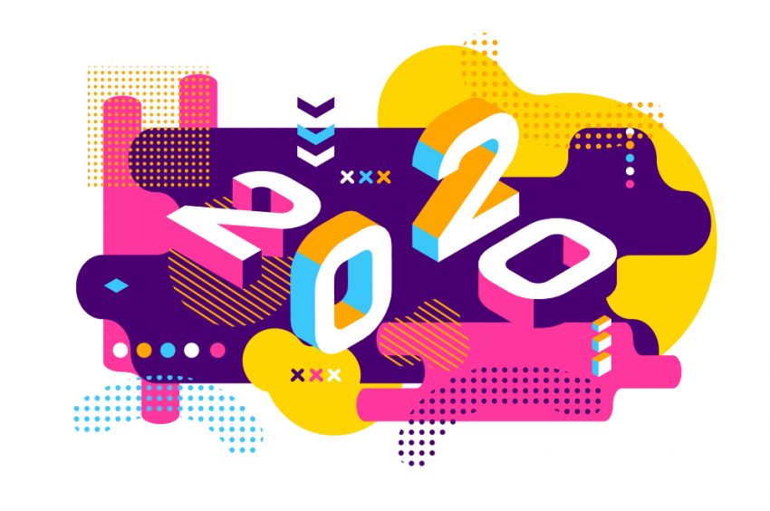
The three –D graphics are generated
and displayed in 2-D space. An artist design in such a way that it looks
life-like accents in this style. When artists design this, it offers a
lightening effect on art. Sometimes, you may have to compromise on a single
color shade. It may have a gradient effect but the color may remain one. The
main purpose of this design is to give depth and illusion of volume in the
image.
You can use this technique in the
books to give an idea of a 3-D image to the kids. Parents will feel easy to
explain the picture or the story that surrounds it. Moreover, kids will love to
explore more about the image that is illustrated in the book.
books to give an idea of a 3-D image to the kids. Parents will feel easy to
explain the picture or the story that surrounds it. Moreover, kids will love to
explore more about the image that is illustrated in the book.
Retro/ Vintage:
If you like to show your feeling,
then you will love this design. Retro does not only convey the feelings but
also the particular connection with the reader. The reader will feel as if it
is his or her image and will feel comfortable around it. This design is simple
but energetic that reminds you of the past and memories. When designers start
illustrating they take full, the advantage of every targeted audience who has
loved the original retro designs sometimes.
The Victorian Era inspires this style
of design. You can find this form of design in the music theme and its visual
elements. You may its usage in the decorating walls, hand-drawn typeface, and
sometimes in the letterpress. This is the style that everyone loves it.
of design. You can find this form of design in the music theme and its visual
elements. You may its usage in the decorating walls, hand-drawn typeface, and
sometimes in the letterpress. This is the style that everyone loves it.
Abstract:
This is an independent piece of the
art, look real when it uses colors and shapes based on the single concept of
the designer or the client or sometimes both. Any design that includes random
line, shape, print or patterns is the part of the abstract. They are made
perfect through random shapes, lines, and patterns. This design represents the
personal opinion and undefined, unclear representation of the objects.
Typography:
This design style includes letters
and fonts. In this design, you can easily redefine the designs or the writing
style. This type of graphic design is also used in the logo making as well as
books like children and novels. It attracts the audience in different curiosity
to understand the typography.
and fonts. In this design, you can easily redefine the designs or the writing
style. This type of graphic design is also used in the logo making as well as
books like children and novels. It attracts the audience in different curiosity
to understand the typography.
When you create to write a book, you
generally choose a font and font size for writing. Just like that, when
designers design the cover page of the book or illustrate the image according
to the story then they use particular typography to explain the dialogues of
the characters. Each font has its different characteristics and meaning.
generally choose a font and font size for writing. Just like that, when
designers design the cover page of the book or illustrate the image according
to the story then they use particular typography to explain the dialogues of
the characters. Each font has its different characteristics and meaning.
Minimalism:
Minimalism is a conceptual ideology
that is never trendy. It was around 60 years ago and it is still important
today. Through minimalist design, the primary aim is to tell more by revealing
little. Simple, smooth and timeless, modern style. The drawing board includes
needless artifacts and flourishes. Only the appropriate item is included for
transmitting the post.


